


Huawei - Uplifting Pitch
Huawei is a Chinese multinational technology company. Their original logo consists of 2 characters, the first one “Hu” is derived from the Chinese work for flower, and the second character “awei” means achievement or action. Combined, the two characters mean Chinese achievement.
The Uplifted logo includes the Moon Typeface which is a minimalistic and classy urban sans serif typeface, it is also in black to show elegance, richness, sophistication and intelligence.
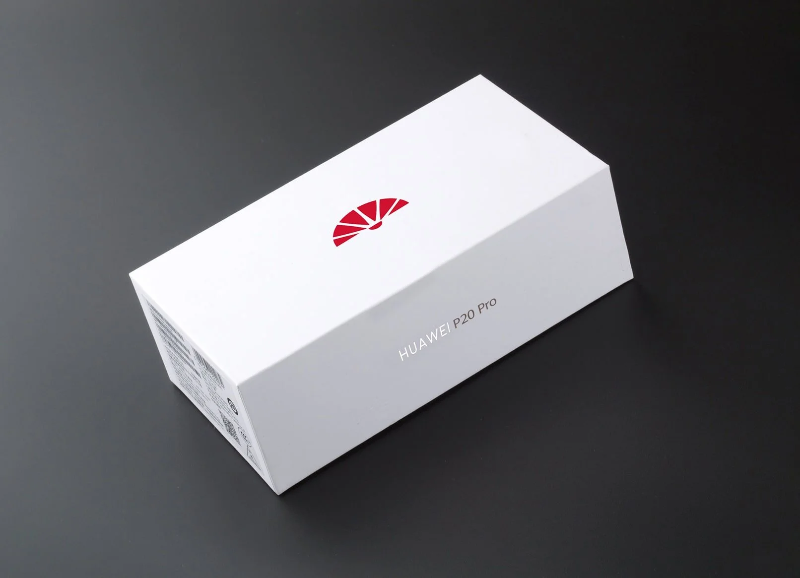
The new emblem uses the petals from the 2018 version of the logo, cut in the shape of a traditional Chinese fan. The tradittional Chinese hand fan, is an artistic symbol of Social Status, which reflects Huawei’s importance in relation to society.
The semi circle resembles the part where the fan is held, while also keeping its original meaning as a ray of sunshine. The billboard is a launch ad for the rebranding.
As for the social media campaign, it is a play on words. “Who are We” is a kind of homophone (a word that sounds the same as another word but has a different meaning and/or spelling) for the word Huawei. In the new launch the focus is on the consumers, and finding how the new phone suits them.